Why Are Some BMW Logos Red Color? Explained
How well do you know Bayerische Motoren Werke (BMW)? You’ve probably seen this logo on the road, in the showroom, or perhaps you’re a proud owner of a BMW yourself. Have you ever wondered why some BMW logos are red? Have you ever tried to get an explanation for it?
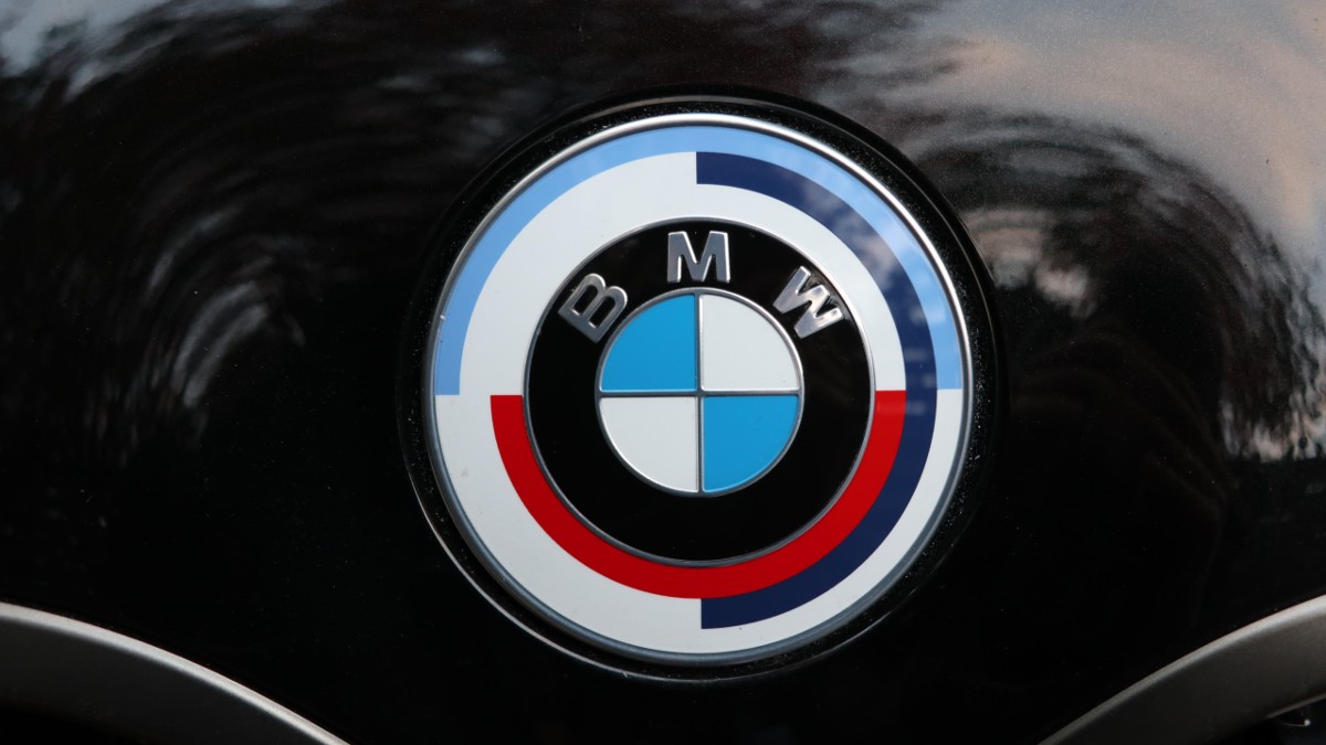
BMW M reintroduced a logo with red instead of the usual blue and white to celebrate its 50th Anniversary in 2022. The red color dates back to the split of Germany during the second world war and the company’s potential partnership with Texaco in the 1970s.
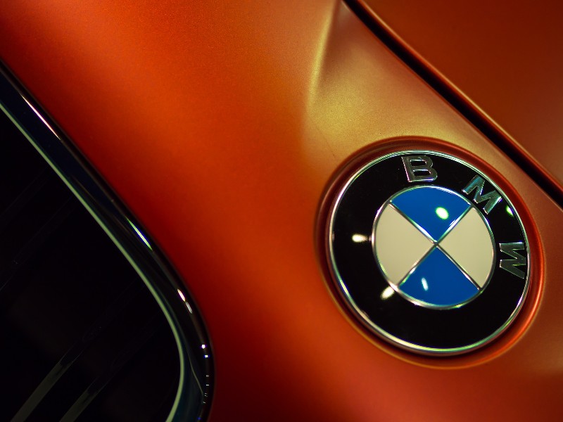
The BMW logo today has two circles, with the inner one having a check pattern in white and blue. A wider circle includes the letters BMW on a transparent background. The logo’s words are in a sans-serif font, all in capital letters.
The company has used this logo for a long time, and it appears on all brand merchandise, including its vehicles. This logo is known as BMW Roundel. Although the company has tweaked its logo various times, the signs of the original concept remain visible.
What Does The BMW Logo Mean?
The logo focuses on the car maker’s Bavarian background. Inverted colors of the Bavarian flag are on the logo to pay homage to the company’s heritage. However, you can draw various meanings from the logo.
Circles encasing each other portray inclusion, connectedness, and community. The simple sans-serif font makes the company seem friendly and engaging. Many people still connect the company to its aircraft history.
White and blue patterns in the middle portray an airplane propeller.
What Are The BMW Logo Colors?
The color of the font and logo outlines has changed several times. Blue and white are the most popular choices representing the flag of the Bavarians Free State. The color arrangement is inverted to avoid infringing on the trademark.
There have been partial changes in the color shades used over time, but the color choice is consistent. The brand’s official colors are white or silver, but others have been used, including white shades, gold, and silver.
What Is The History Behind BMW’s Colors?
Marc Thiesbürger, a motorsport historian for the BMW Classic Group, revealed that the company’s three M strips originated from a potential merger between BMW M and Texaco during the 1970s. BMW attempted to partner with this company for its motorsports program.
During the talk, but before they were finalized, BMW produced a new racing livery to court the potential partner leading to the birth of the three stripes livery. Its blue color represents BMW’s Bavarian roots, and red represents Texaco as the official brand color. Dark blue combined the two.
BMW attempted to show solidarity with its potential partner. Although the deal failed, the livery looked good, so BMW decided to keep it. The red color now represented motorsport, not Texaco.

How Did BMW Logos With Red Color Come About?
There are two versions of the origin of red in the BMW logo.
Historical Version
There’s also a historical version of the origin of the red color in the BMW logo. Germany had to split into East and West after World War two. Each side had factories manufacturing cars and motorcycles under the BMW brand.
It was pretty confusing for the companies in East and Germany to continue operating under the same brand. A lawsuit in 1952 made the factory in Eisenach in East Germany switch its name to Eisenach Motorenwerk (EMW) and remove the blue color on the logo to red.
All post-war vehicles, such as the EMW 327, had the new red and white logo.
Modern Version
The German car maker decided to introduce a series of limited edition models and a new roundel inspired by the BMW Motorsport logo to celebrate its 50th Anniversary on May 24, 2022. Models M3, M4, X3 M, X4 M, X5 M, and X6 M produced from March 2022 were to have this logo.
Optionally, the red logo was to be available on BMW M models, including:
- M340i
- M440i
- X3 M40i
- X4 M40i
The new logo was not included when ordering a car with just the M package. This fantastic and unique offer in the history of BMW was available from January 2022. The anniversary emblem was available as an accessory or part item.
Apart from the refreshed BMW roundel, the company also offered 50 iconic paint finishes with historical significance on selected BMW M throughout 2022. The style-defining colors that represent an era in the 50 years history of the car marker are:
- Daytona violet
- Frozen Marina Bay Blue
- Macao Blue
- Dakar Yellow
- Imola Red
The new logo had shifted semicircles in violet, blue and red. It was first used on racing cars in 1973. In 1978 after the debut of the BMW M1, the color stripes reappeared slanted on the right of the car, leaning on the letter M.
What Events Highlighted BMW’s 50th Anniversary?
As part of its 50th Anniversary, BMW planned to unveil new high-performance automobiles to meet the growing demand worldwide. The company planned to launch the BMW M3 Touring and a particular version of the BMW M4 Coupé series for performance-oriented fans.
BMW was also in the advanced stages of following up on the success of the BMW M2 and the electrification of the M3. The Anniversary was an opportunity for the company to launch its first high-performance electric car model in the history of the BMW M.
Apart from celebrating the Anniversary with attractive new products, the company planned various events too, which included anniversary performances at:
- Concorso d’Eleganza Villa d’Este, Lake Como
- Goodwood Festival of Speed, Great Britain
- Concours d’Elégance in Pebble Beach, California
- 24 Hours of the Nürburgring
Conclusion
The BMW logo with blue and white is the most common. However, the company reintroduced a new roundel with red to celebrate its 50ths Anniversary in 2022. This color scheme dates back to World War two with the split of Germany and the potential partnership with Texaco in the 1970s.


