What Do The Ducks In The Cadillac Logo Mean & When They Have Been Removed?
The Cadillac brand has existed for over a century for more than 110 years of existence. Its logo has endured about 40 modifications. Perhaps you’re wondering what the ducks in the Cadillac logo mean and when they were removed.
The ducks in the Cadillac logo are actually merlettes. These six merlettes were three on each side to represent the maternal and paternal noble lineage. The ducks were removed from the logo in 2020 to match the new generation of Cadillac electric models.
Cadillac was named after Antoine De La Mothe Cadillac who founded the city of Detroit. The car company adopted an insignia with a coat of arms. It featured six black ducks known as “Merlettes” in 1905.
What Is Cadillac’s Background?
Cadillac is a division of General Motors. In 1701, Antoine de la Mothe Cadillac headed a group of explorers to the US. They settled in the northern part of the country and named it Ville d’Etroit. It was later renamed Detroit which became an industrial center for car makers.
In 1902, two investors, William Murphy and Lemuel Bowen joined forces with Henry Leland to establish Cadillac. These had worked with Henry Ford. Cadillac produced 2500 car units by its first birthday.
The company won the British Dewar Trophy for excelling in technical innovation in 1908. It was the first time an American car maker won this award. General Motors had to fork out $4.5 million to merge with Cadillac.
By 1912, Cadillac unveiled a car with the world’s first electric system. It powered the lighting, ignition, and lighting. After three years, the carmaker released a model with a V8 engine running at 65 mph.
What Do The Ducks In The Cadillac Logo Mean?
The ducks represent the holy trinity from the time of the Crusades. Cadillac’s logo has three ducks on one side representing the nobility of the mother’s lineage. Other ducks represent the father’s noble lineage.
The merlettes were usually included in the coats of arms of knights who participated in the crusades. Including them in the logo was inspired by the idea that they could fly without landing. The logo has been modified several times and the ducks have since disappeared.
Why Did Cadillac Remove The Duck From Its Logo?
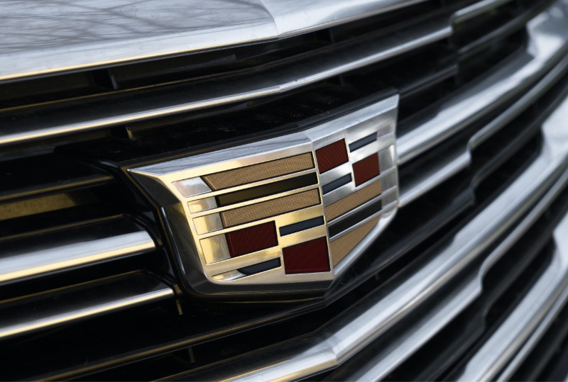
The merlettes or ducks were removed from the Cadillac logo about 10 years ago as the logo got modernized. It was done presumably to streamline the look of the crest. Removing the ducks makes the crest in sync with the design of new generation Cadillac models.
The most significant redesign of Cadillac’’s logo happened in 2020 to introduce a new sharp-edged art science design language. Its coat of arms became more geometric while the merlettes were discarded.
Cadillac models including Escalades and the President now started having a ‘cheapcraptastic’ version of the original logo.

What Other Changes Were Made On The Cadillac Logo?
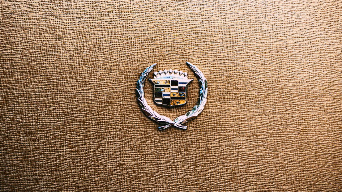
The Cadillac logo used to have ducks and a crest. However, it was redesigned to give it a more streamlined look. A redesigned logo would appear on 2015 models. The wreath was considered outdated and obsolete.
It was taken to be going against the brand’s cutting-edge image built over the years. Additionally, the new single-piece logo was viewed to give designers more flexibility during positioning on vehicles.
Introducing the new logo came with costs such as changing marketing material, rebranding dealerships, and acquiring new signage. The logo was also widened going back to the 1960s design. However, the brand remained true to its original branding by maintaining its right colors.
How Does The Cadillac Logo Look Today?
Cadillac’s logo got the wreath removed in 2014. The current logo has an elegant cursive wordmark beneath it. Lettering with smooth and sophisticated lines balances the sharp and brutal shape of the crest. The thickness of the crest lines celebrates the brand’s rich legacy and history.
The carmaker unveiled the first-ever electric car in 2019 with a new logo. The inspiration for the new logo was to match the power and sleekness of the car. This new monochrome logo has blank space that creates a futuristic look.
What Is The Inspiration Behind Cadillac’s New Logo?
GM unveiled the new logo to adorn its future Cadillac models. It’s a move towards its proposed production of only electric cars. The log has the same basic design with a crest but without the usual colors. Brands such as Volvo and Nissan were the first to have black and white logos.
An official announcement from the company revealed that the new backlit logo was to feature only on electric cars. The old logo with color was maintained for vehicles powered by an internal combustion engine.
Chrome and silver logos were available for existing models. The new logo was part of the brand’s effort to produce all-electric powered vehicles by 2030.
When Was The Crest In The Cadillac Logo Designed?
Cadillac designed the logo for the car company himself. The crest was designed when he got married in 1687. He switched his name to Antoine de la Mothe Cadillac during military service aged 24. It was to make everyone believe he belonged to a noble society.
He borrowed the coat of arms from his former neighbor, Baron Sylvester. The crest on the Cadillacs belonged to the real La Mothe noble family. Elements on the logo are Martin’s heraldic adaptations.
Closing Thoughts
Cadillac is among the leading luxury car brands in the world. Its logo has gone through over 40 alterations including removing the merlettes. The log today is black and white without the wreath and the merlettes.


